Player Development Mobile App
For casino properties, player development is the frontline of defense. Hosts use the app to move players into their pipeline to drive sales, events, offers, and hotel reservations. After several rounds of user interviews with player development managers, host managers, and hosts; we put together a working prototype that could be built in one quarter using AGILE processes. The project is still WIP and we have tested this prototype with the aforementioned users and have received positive feedback.
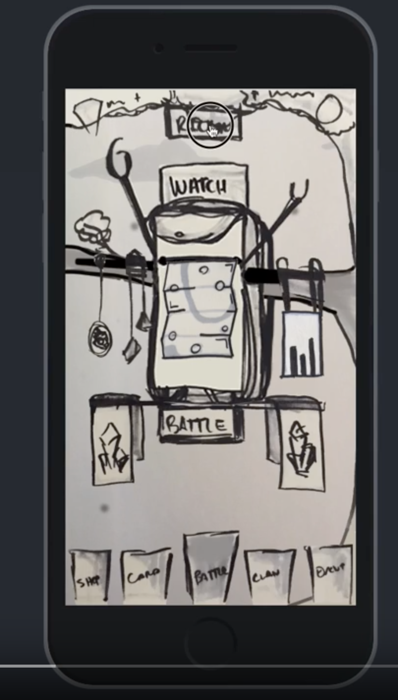
Everything begins with research, assumptions, and whiteboards. The first step in this process was to talk to a sample of ~20 users. We came up with a list of 11 questions that cover topics surrounding their work day and their workflow. We ask questions like: “What does a successful day look like for you?” to “Tell me about a day in the life of…” These questions draw out organic answers that begin to form a picture. From this picture we can determine pain points, problem areas, and potential solutions. Our first iteration is below.
PROBLEMS TO SOLVE:
1) Our current solution was slow and cumbersome.
2) Player Hosts need to see real-time data of their players on the floor and be able to search for them.
3) Host Managers would like more accountability with task completion by their hosts.
HOW I SOLVED THEM:
1) We already had a mobile solution that sort of solved these problems. The main issues with the app were functionality, speed, and data flow. Often times a host would be notified that a player was at a slot machine, only to get there and the player was gone. We called this “ghost chasing.” This was a common theme across all the clients using this app. We heard about this problem across twenty interviews. The way I solved this was to first come at the app with a fresh perspective. Because the current solution was not a true native app, my suggestion was that we spend the time and focus on developing a new native app to replace the web app. This would allow for more efficient user flow, push notifications (which we did not have and many were asking for), and better responsiveness. We could remove the slow, cumbersome interface of the old app and solve a lot of experience problems with a native app. There were a few internal stakeholders who held opposing views on the native app concept. The product team was able to convince them this was the best course of action.
2) The primary focus of this app needed to be this: “who is on the floor now” and “help me search for players”. As you can see in the whiteboard prototype (linked below and here), this was accomplished on the home screen. We removed a few steps and barriers in the old app by bringing those two views to the forefront. We refined this home screen several times through user interviews and iterations before arriving at the hi-fi prototype version (also linked below). Players on floor would give the hosts the quick glance view they needed and having a search bar as the one of the first things you see was a huge win and garnered lots of positive feedback in our interviews.
3) While our primary persona was the host, we also had to satisfy the host managers whose main responsibility is to keep their hosts accomplishing tasks. Tasks are all about connecting to the players to get them into play slots. Playing slots = revenue. This was a large conversation that spanned multiple interviews with hosts, managers, and even execs. How do we encourage the hosts to accomplish their tasks without the host feeling “watched” or “micro-managed.” Ultimately, we were able to find a design that satisfied the hosts and behind the scenes, the managers. This product was halted at the end of 2019 due to financial constraints of the company.
Click here for whiteboard prototype.
After we completed the above iteration. We went back to our users and asked them about the prototype. We asked them to perform simple tasks such as: searching for players, completing tasks, and calling players. Armed with this data, we asked ourselves what can we get done in 90 days? The working prototype below is the initial solution.
Skills Employed for this Project:
Worked with product management on project objectives and allocate resources to achieve the objectives as measured against plans
Whiteboarding
Map, maintain and evangelize the end-to-end customer journey for this new experience
Lo-fi/Hi-Fi prototyping
Design and conduct qualitative and quantitative research studies, including user interviews, in-person or remote usability studies, focus groups and surveys
Product creation and iteration
Led the team of designers and PMs by establishing timelines and implementation
Tags:
User Experience, User Interface Design, Wireframing, User-centered Design, Interaction Design, Information Architecture, Product Management, Project Management, Data Analytics - Pendo, User Research, Business-to-Business (B2B), Management
Pandemonium E-Reader Mobile App
The Pandemonium app provides a way for screenwriters to get their screenplays read, sold, and perhaps turned into a movie. After some initial user research and competitive landscape research we decided on a scaled back look and feel with the ease of the iBooks store. The app has been very well received and ties into the website and branding established by Pandemonium.
Tags:
User Experience, User Interface Design, Wireframing, User-centered Design, Interaction Design, Information Architecture, Product Management, Project Management, User Research, Business-to-Consumer (B2C), Native App
Skills Employed for this Project:
Worked with client on project objectives
Design and conduct qualitative and quantitative research studies, including user interviews
Whiteboarding
Lo-fi/Hi-Fi prototyping
Product creation and iteration
Mobile Game - Front Runners Game
Created, produced, launched a mobile game. I oversaw all art production, user flows, monetization, UX, marketing, and development of the hit game Front Runners.
Check out a video of the game.
In February of 2020, I sat down with some friends who have amazing game experience and love mobile games. I came to the meeting to have them tell me all of the horrible reasons as to why I should not attempt to start a mobile game studio. I wanted them to talk me out of it, tell me how hard it was and the insurmountable odds to overcome. A few hours later and we were talking about an idea for a game. A few days later we were starting production of Front Runners.
This has been an incredibly fun project. From ideation to launch, there has not been a single dull moment. We have built a fun little game and we know that many people will love it!
Download the game here:
🍏App Store: https://apple.co/3dL4sMY
📱Google Play Store: https://bit.ly/3iLia65
Skills Employed for this Project:
Worked with production team to create original artwork, look dev, and game play.
Integrated monetization gates and IAP opportunities.
Created all marketing materials, website, and communications.
Produced and shipped a mobile game in 4.5 months.
Mobile Game Prototype
Working with some of the best in the game industry on a TBA mobile game, was an amazing experience. Leading the charge on rough design, initial user flows and gameplay, as well as look development. We did many conversations with mobile game users and watched multiple people play the most popular 3v3 mobile games (i.e. Clash Royale, Brawl Stars, etc.) This set up the initial conversation of how we want users to experience our story through the UI. We relied heavily on “vibe” to guide the drawings. How does each screen make the user feel? Does it draw them into our world? Is it engaging only in black and white; as well as no sound? If we can draw users into the story with hand drawn images and light interaction, we know that the strategic advent of color and sound will enhance the experience.
This was a fun way to do some light animation to entice investors and show them some very rough ideas of how we see the menus and some monetization working. All chicken-scratch drawings and animation done by me in a now deprecated program.
Tags:
User Experience, User Interface Design, Wireframing, User-centered Design, Interaction Design, Information Architecture, Business-to-Consumer (B2C), Native App, Mobile Game, Creative Design
Skills Employed for this Project:
Work with the creative on project objectives and roadmap
Whiteboarding
Product research and creative design
Lo-fi prototyping
Interaction design
FORM Lifting Mobile App
Now defunct, FORM had a unique mobile app that was able to track your power and olympic lifts via a barbell collar. It was a great mix of hardware and software, containing 8 accelerometers and an altimeter it was able to read speed, height, and lift. Sadly due to lack of funding the company wasn’t able to continue after selling a couple hundred units. We were just gearing up to add workout subscriptions from numerous lifting influencers. The images above represent different screens of the app.
Hit the buttons below for more in-depth conversation about some of the projects from FORM.
Tags:
User Experience, User Interface Design, Wireframing, User-centered Design, Interaction Design, Information Architecture, Data analytics - Pendo, Project Management, User Research, Business-to-Consumer (B2C), Native App
Skills Employed for this Project:
Design and conduct qualitative and quantitative research studies, including user interviews
WhiteboardingUser Journey mapping
Lo-fi/Hi-Fi prototyping
Led the team of designers and PMs by establishing timelines and implementation


