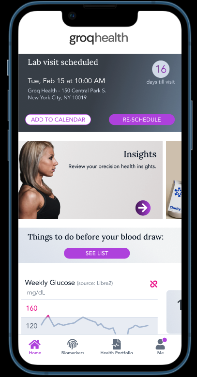
PERSONAL HEALTH APP, 0-1
Project Type
End-to-end
0-1
User Flow
My Role
Lead Designer
Outcome
Contribution
User Research
Interface Design
Stakeholder Management
Project Management
Complete MVP
Integrate 3rd party wearables within app
Improve onboarding flow
Overview
My Role
Groq Health is a boutique, personal health startup. Based off of its founders physical practice in NYC and Silicon Valley; the goal was to create an app that followed the path of health from the in-person locations.
It was a major undertaking to replicate a user journey that had been in place for decades and convert it to a digital experience. Not only was there a customer user flow that included digital onboarding, it had to be paired with a physical onboarding (blood draws, V02 Max, Glucose Testing, etc).
In addition to the customer journeys that were already in place, there were clinicians who also had workflows that needed to converted digitally as well. This included things like in-app chat, prescribing medication, insights and interventions based off of customer tests.
In the end, we were able to produce a beta product (still to this day) that functions and is still improving.
As the UX designer, my role was to meet with users, clinicians, executive staff, and product team to come up with a refined onboarding flow. As well as the creation of the app from scratch.
Defining the problem
Problems for users
Problems for the business
Goal
As I stated above, the primary problem was to replicate a user journey that was familiar to clinicians IRL but foreign to new users digitally.
How can we take the process that is already in place in physical locations and make them as intuitive and easy in an app?
This was more complex than any of us imagined as our executive team wanted to start very small and focused, which made sense. As time would progress, the journeys between physical and digital would quickly become muddled.
Need to understand what the program is all about
Lengthy, confusing onboarding flow
Understanding the data presented to them
Replicate what is already working
Get 25 beta users
Enable ML to expedite response times
Increase customer education
Break up onboarding into phases
Launch a beta test
Solutions
Educating the Customer
Phased Onboarding
Launching a beta
Understanding information about our health can be complex and alarming. One of our primary experiences in the app is our biomarkers screen. The data returned from a blood draw would paint a picture of where your health is today.
We had several iterations of our biomarkers screen, from the elaborate to the simple. In the end, widely accepted colors and visualizations would prove the most effective.
The first round of onboarding was insane! 40+ screens, dozens of questions…it took over 20 minutes. Classic doctor’s office form filling out.
I got in and changed that ASAP. One of the most important aspects of onboarding is getting the user into the action as early as possible. For Groq that meant we needed some basic information upfront. After that information was collected we would send them to a home feed that led them through leveling up onboarding. That meant things like scheduling a blood draw, setting up your pharmacy, adding a wearable (CGM, Apple Watch) - these were all things that would improve the experience within the app. However, they didn’t all need to happen when you opened it up.
Eventually we got to the onboarding experience that worked for our users…after about 5-6 iterations and clarifications.
0-1 is hard because you make A LOT of assumptions first. You can get as much customer info as you want, until you launch - you will not know if you have PMF.
Furthermore, adding real world complexities like a blood draw and the ability to add a continuous glucose monitor via prescription; only amplify the challenges.
On top of that, working with clinicians who already had an analog workflow and translating it to digital…well now we’re really talking about a steep hill.
In the end, the beta that we were able to design and release was not without its bugs and successes. One of the benefits of being part of a small team is the ability to adapt and adjust quickly. We were able to make experience improvements based on our initial testers feedback within days/weeks.
The clinician side of the product has been a huge focal point as the company attempts to scale. Being able to use templates to customize for the customers has been a major lift and getting the clinicians to adapt accordingly has been lengthy.
No beta is perfect. Groq’s went well and is constantly improving.


